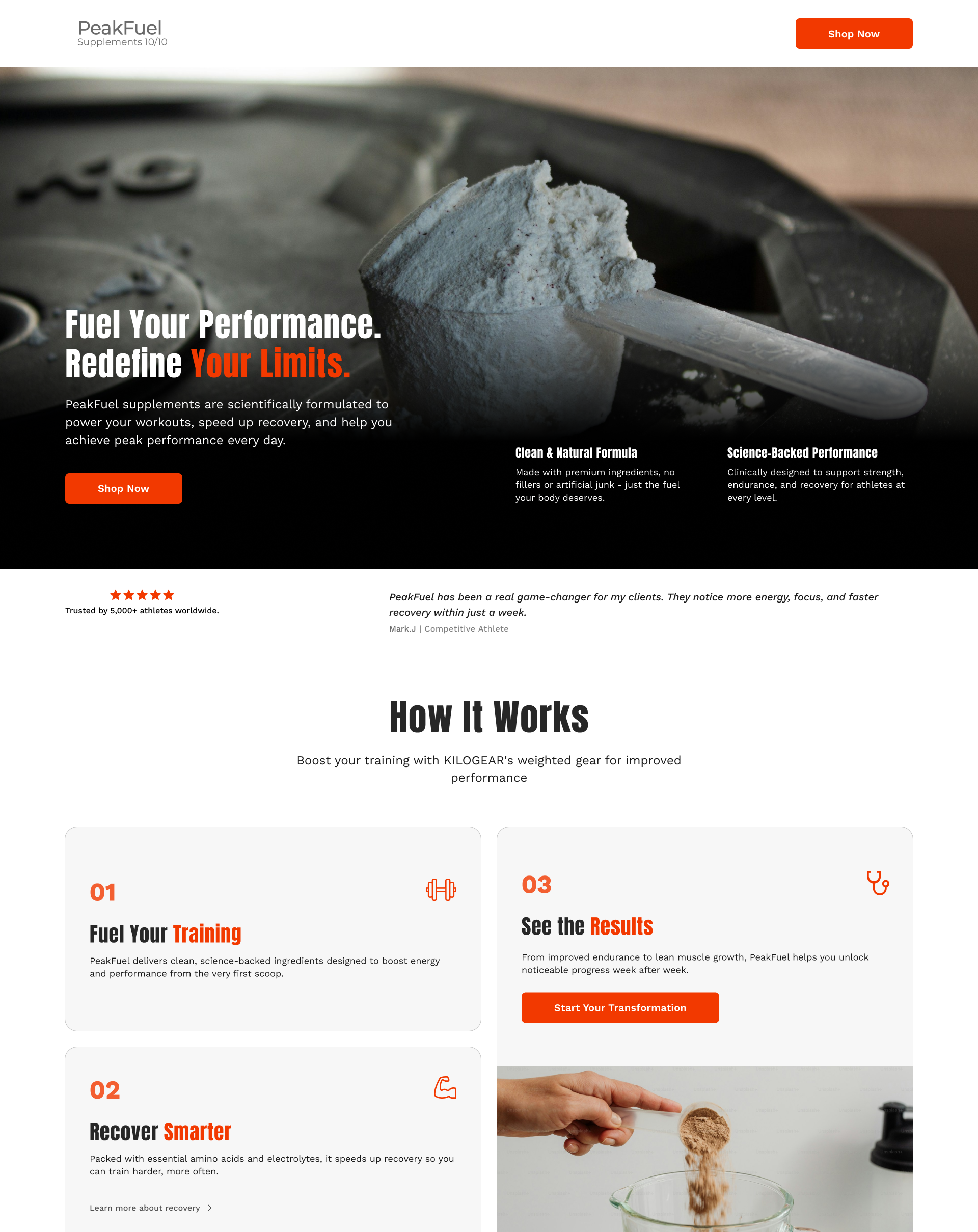
PROJECT OVERVIEW:
The PeakFuel landing page redesign aimed to transform a traditional product-focused website into a performance-driven experience that builds credibility and motivates action. The challenge was to create a design that speaks both to athletes seeking results and everyday users looking for trust, simplicity, and energy.
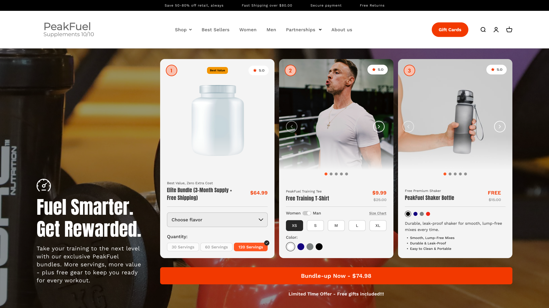
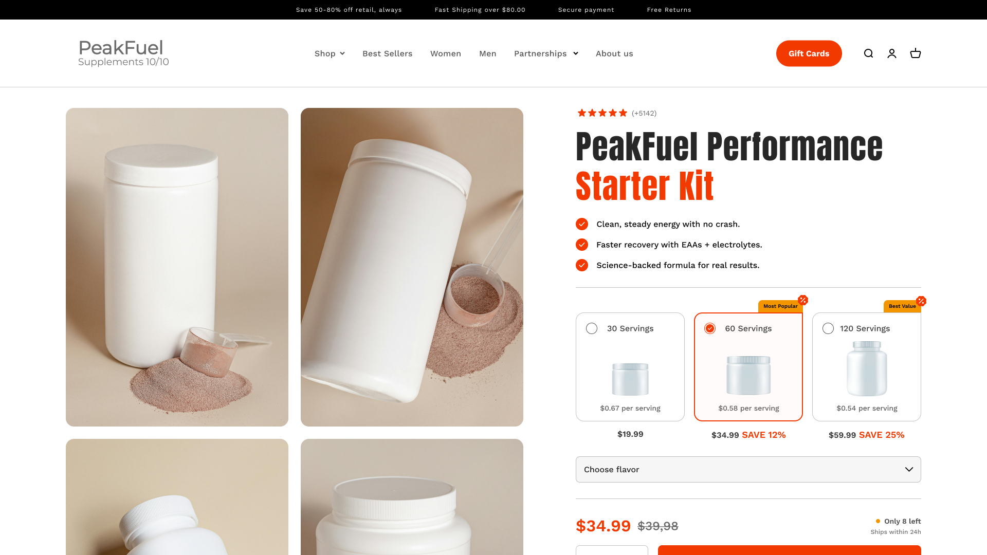
The strategy centered on balancing storytelling and science. The design uses contrast - dark sections with bold typography paired with clean white layouts - to communicate both power and clarity. Each section builds momentum, leading users from awareness to purchase intent through motion, benefits, and real-world results.
The hero section captures PeakFuel’s mission: fueling performance through discipline and innovation. From there, the page flows naturally - explaining how the product works, showing real athletes, and presenting science-backed benefits in an engaging, digestible structure.
PROCESS AND METHODOLOGY:
Strategic Analysis - Reviewed analytics and scroll maps to define optimal section depth and CTA placements.
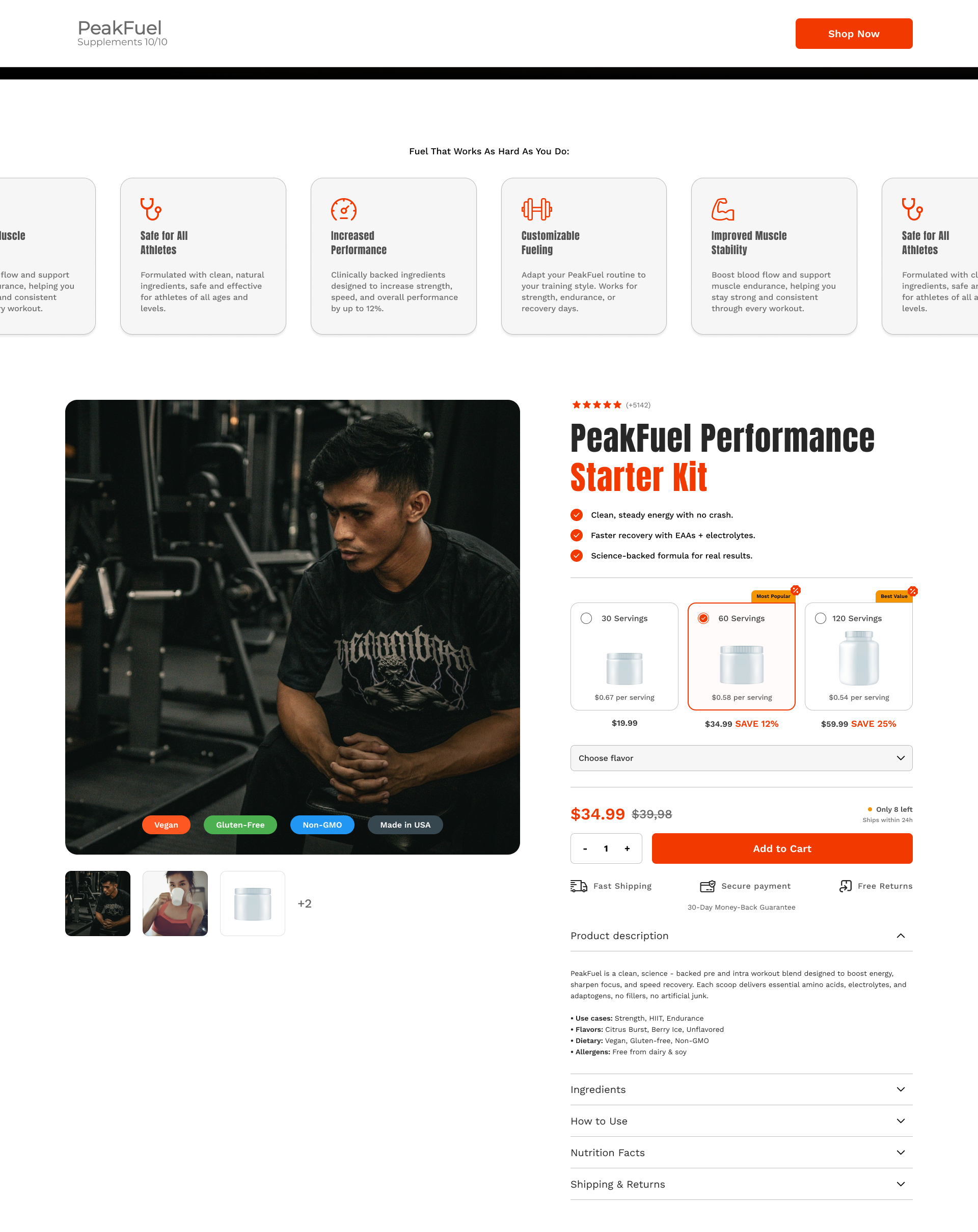
Visual Hierarchy - Designed a modular structure that balances visuals, educational content, and motivational triggers.
Brand Expression - Introduced color contrast and accent tones (black/orange/white) to reinforce strength and performance identity.
Behavioral Design - Integrated micro-animations, progress-based storytelling, and testimonial sliders to maintain engagement throughout the scroll.
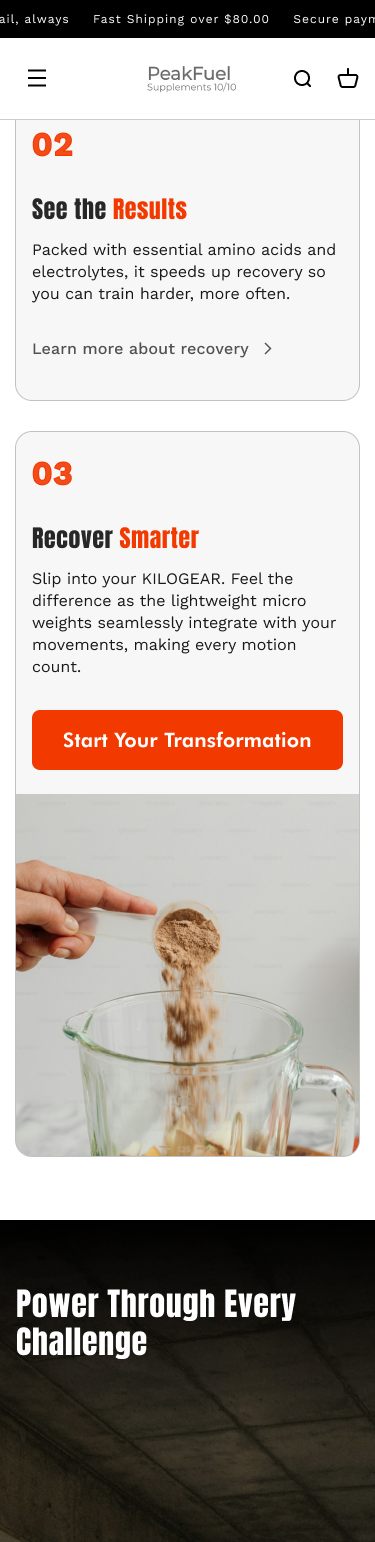
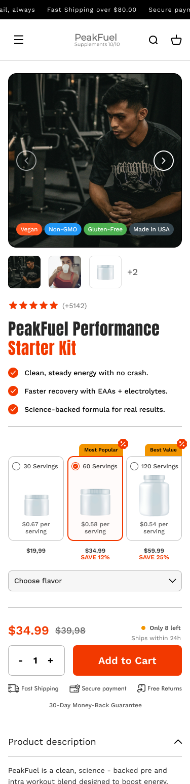
Responsive Experience - Built for mobile-first navigation with prioritized CTA visibility and optimized hero load speed.